CLIENT:

SERVICES:
Brand Strategy / Identity Creation / Brand and Communication Design/ Brand Guideline / Brand Audit
A Lebanese all-time favorite snack. It stood the test of time and every Lebanese knows a manoushe no matter how far they are from home. A manoushe is the simplicity of food with a shared popularity and a strong heritage that makes it such a cultural and culinary jewel.
Close your eyes and remember how you used to stand in line waiting to get your hands on a hot and cheesy manoushe. It is the taste and smell of home. We speak the language of Lebanese tradition yet we infuse it with our own modern twist. This is who we are; this is Man’oushe Street. Man’oushe Street is a tasty delight for all lovers of tradition and good food.
Brand Audit
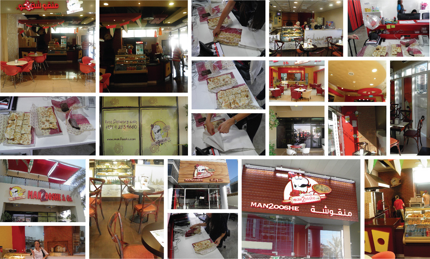
When Man’oushe Street partnered with LAVA Brands, the challenge was to reinvent an already known multi location restaurant and to revise the whole concept of the business and its communication. The existing brand needed to be studied first, so LAVA Brands Teams dove into the brand auditing and then established an identity, brand communication and the look and feel of the customer experience. An in depth audit was done on every aspect of brand from color scheme, typography, display, visual and verbal communication. Dipstick was also conducted to find out the feedback of the stakeholders regarding the image, experience and perception of the old brand.
Brand Strategy
Strategy was redefined according to the response from the brand audit research and market demand trend. A new type of Manoushe product was introduced to the market with a difference placement strategy, targeting different set of audience and uplifted and creative approach of communication.

Moodboard
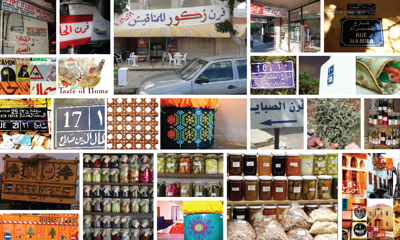
After finalizing the strategic direction for the brand, its visual communication design was developed around the real essence of the name Manoushe (Arabic word meaning simplicity of something), connection to the food’s origin and the touch of modern creativity to rebirth it as a brand of young fun-loving audience. The inspirations were taken from abstract, levantine arts, calligraphy and fresco to develop a hand drawn signature visual communications language.
The Story
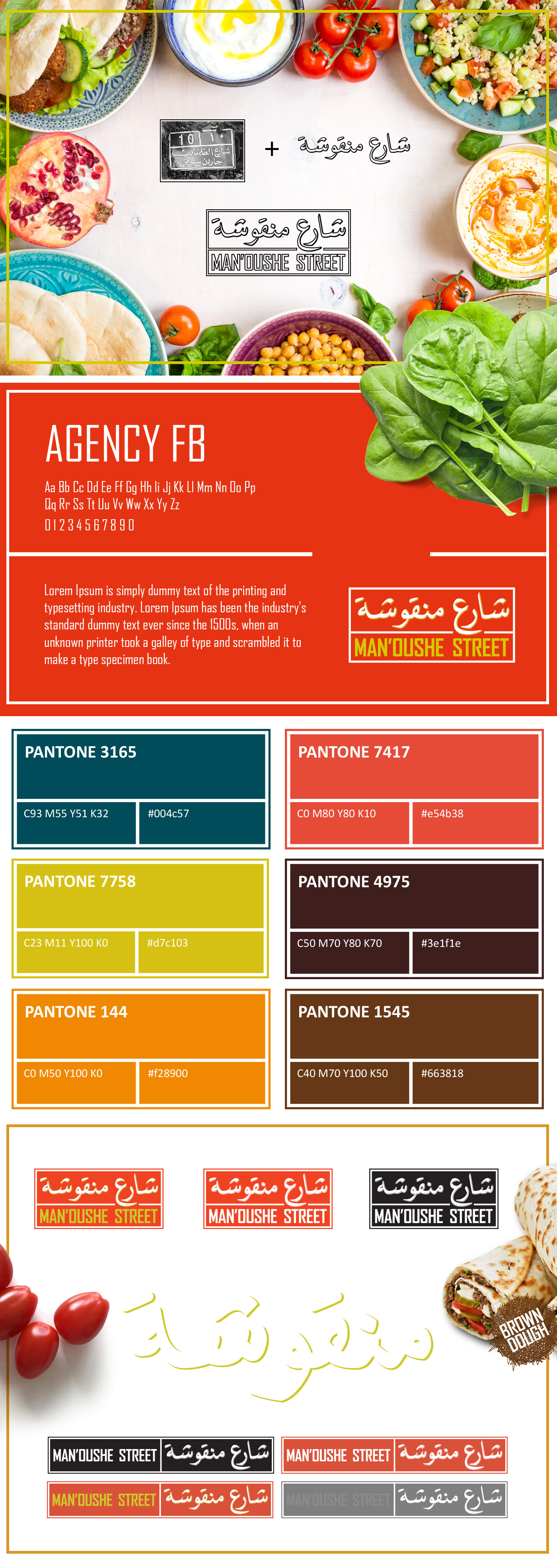
A connection has to be made from the original to the contemporary communication, so street signs from Lebanon were taken into the consideration and went through stages of hand drawn calligraphy to achieve a perfect logo for the new Man’oushe Street. Bright, youthful and fun colors were then added to the communication language to reach the target audience without any distortion.
Visual Language
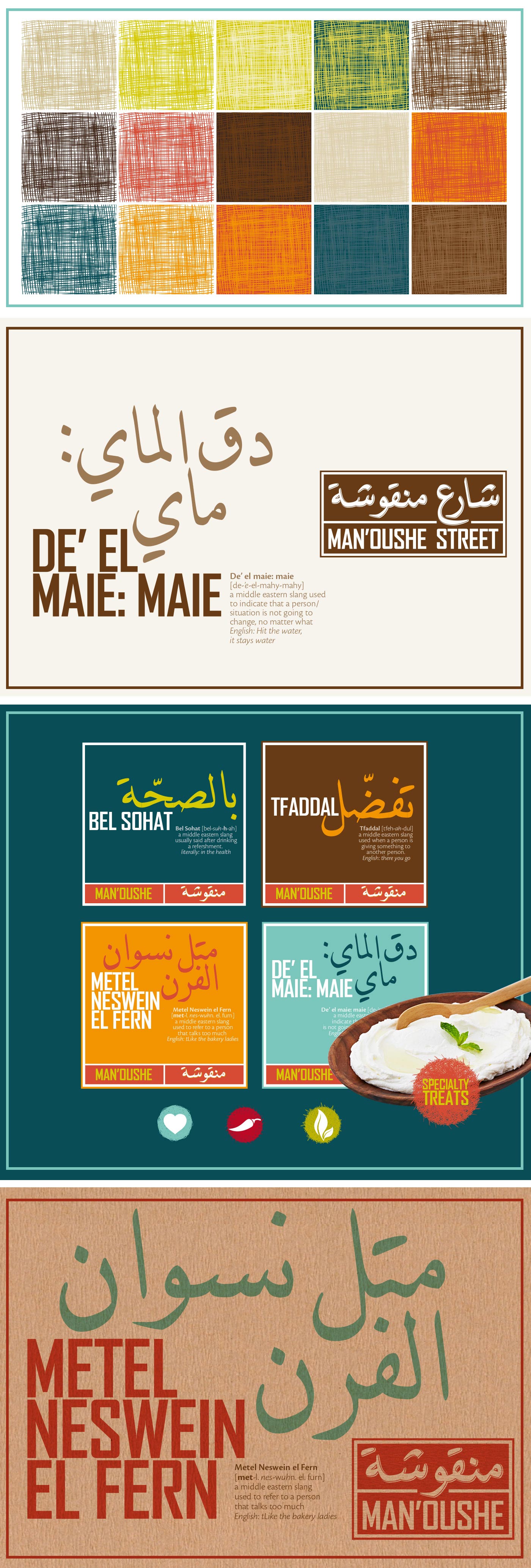
Combining the signature fonts, textures, colors and patterns, a visual language was locked as a guideline as timeless reference for brand communication. From corporate to advertising communication, a sync was created; a harmony of colors, texture and font was molded into a language that communicated the very core of the strategy.

Interior Design
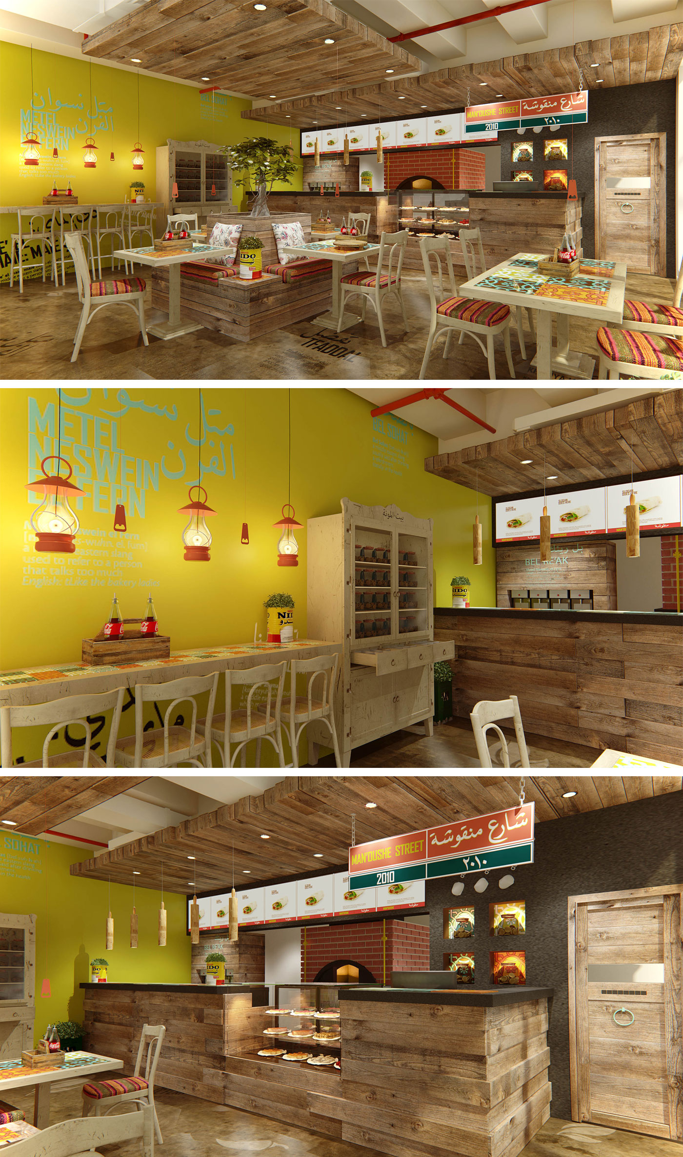
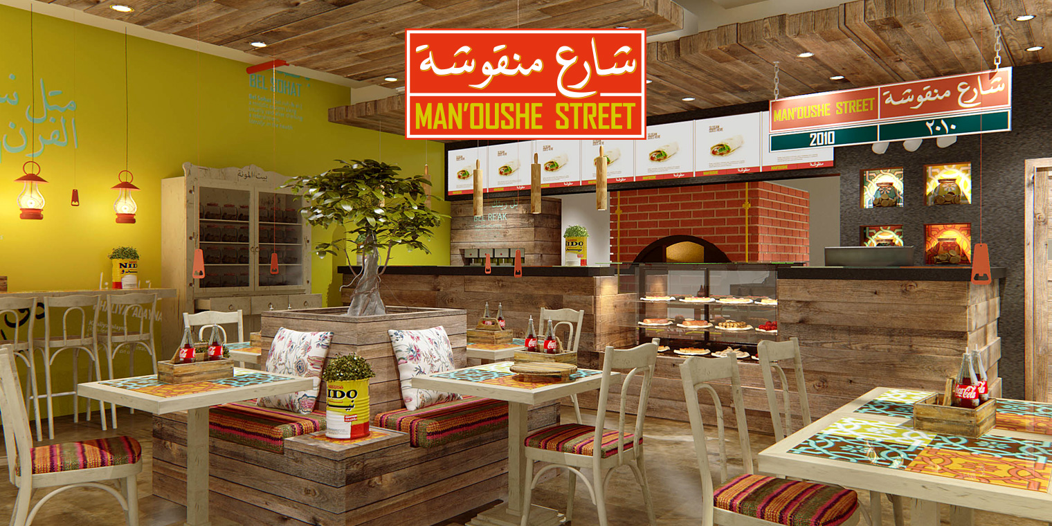
A rebirth of a brand is not complete until the visual merchandising is changed accordingly. To bring the strategy and visual language to life, the interior had to be changed dramatically according to the new direction. A rebirth of a brand is not complete until its visual merchandising is changed accordingly. LAVA Brands dramatically renovates the interior for Man’oushe Street according to the new direction. This uplift of the brand communicates to the fun loving, young, energetic audience who would love to hang out at Man’oushe lounge.
