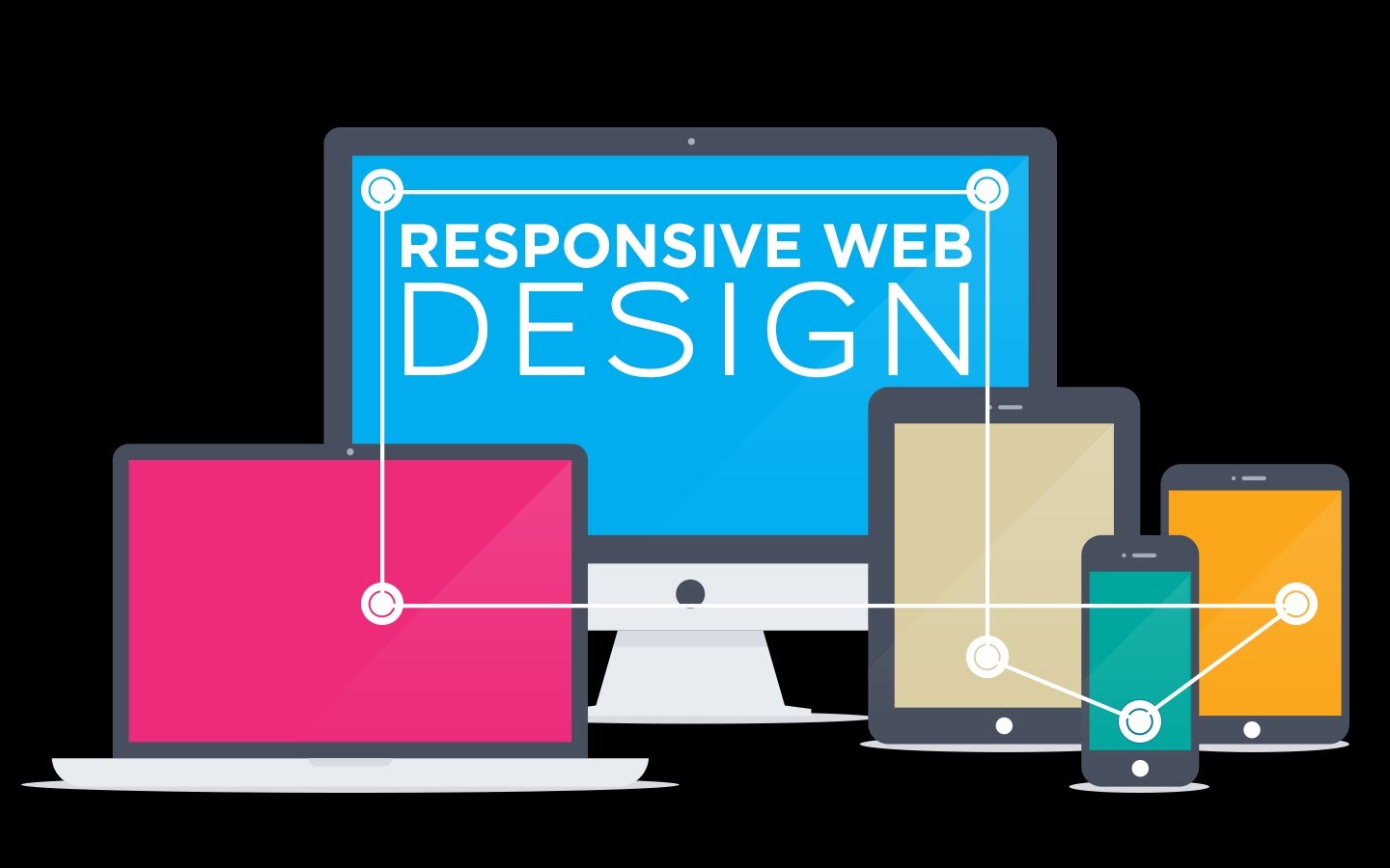
Websites have now become one of the most important things of any business. No matter what business you have, no matter how small your business is or how big it is you will need to have a website from where people can find out about you and your business, a website which will help them to reach to you.
It is because of the increasing demand of websites and web designers that so many agencies are now offering web designing services, not just that but you can also get your website designed from a reliable branding agency if you have a valid budget as they usually have experienced designers on board who can design websites for you.
There are essential things for every work same is the case with web designing. There are many important things for a web designer to know and to keep in mind while designing websites and beginners do need help every now and then. This article is a great help for all the beginners and designers as it will now mention some essential things for web designs. Here we go:
PLACEMENT
Make sure the placement is right: One of the most important things in designing is the right placement. If you mess up the placement your entire design will go off so you have to be very careful will the placement of the elements. For this, you must be aware of the negative spacing and the breathing space concept. Also knowing the rule of the third can help you a lot even in web designing. Your focus must be on placing the right things at the right place while designing a website.
MINIMALISTIC
Follow the less is more rule: This is one amazing rule that is followed all across the globe. Every designer follows this rule no matter how senior or experienced he/she is or if he/she is new at this they got they need to follow this rule. “Less is more” rule makes your artwork beautiful. The fewer things you will add to your design the more beautiful it will look so again its all the game of negative spacing.
RELEVANT
Avoid too much information: Keeping the “less is more” rule in the mind also make sure you do not make your design text too lengthy, people do not have time to read too much text, so just add the relevant and important text and place it in such a way that it doesn’t look like an essay, you can get great quality content from a reliable assignment writing service if you have a limited budget as they usually have working students in their team who can write good content for you. Placement of text can also make your design look too lengthy and busy. This doesn’t mean you miss out the important information. There are a lot of things that have to be on the website no matter what because that’s the main purpose of the website to spread awareness and let people know about your brand and your contact information.
VISUALLY APPEALING
The visually strong design is always a win: People love looking at visually strong designs, so when people open your website they should get something good to see, something visually strong and having a clear message. Weak visuals can make the person leave your website within a few seconds. Focus on making the website visually strong by playing with colors, placement, and text. A number of web templates are accepted and sold just on the basis of strong visuals.
TARGET AUDIENCE
Keep your target audience in mind: Never forget your target audience while designing a website because they are the one who will be visiting the website, they are the one who will judge you and your work, they are the one who will decide to go further with the website or just switch to another fancy good looking website. Make sure you design your websites according to the target group. In case of a kid’s website make it colorful and use bright colors, in case of health-related websites use sober and darker shades.
COLOR SELECTION
Color selection must be correct: Color selection plays a very important role in website making and this is that one thing that most of the young web designers miss out. All the websites cannot be bright and funky and also not all websites can be dull, dark and boring. You should know how to use colors and where to use it on a web template so that you can even make the design look attractive despite using dull colors. Keep the brand in mind while selecting a color as mentioned in the above point.
RESEARCH
Research is a must: Another mistake made by most of the young web designers is that they run away from research. Always keep in mind that you cannot just start designing a website by just opening your laptop and the software. You need to carry out a short and a quick research (detailed research is also required in some cases). This will help you a lot in color selection, placement and other steps of web designing.