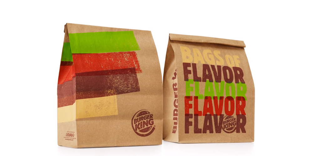
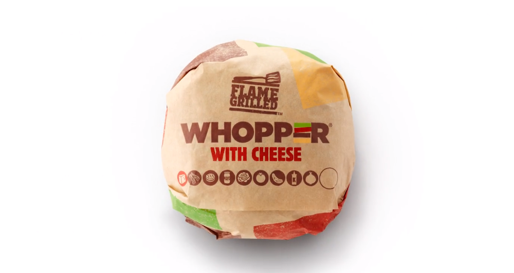
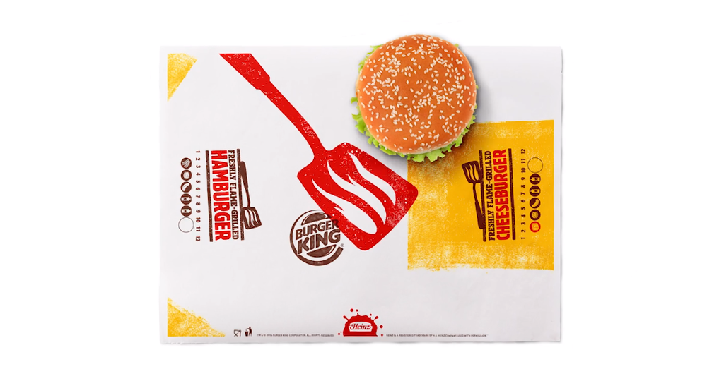
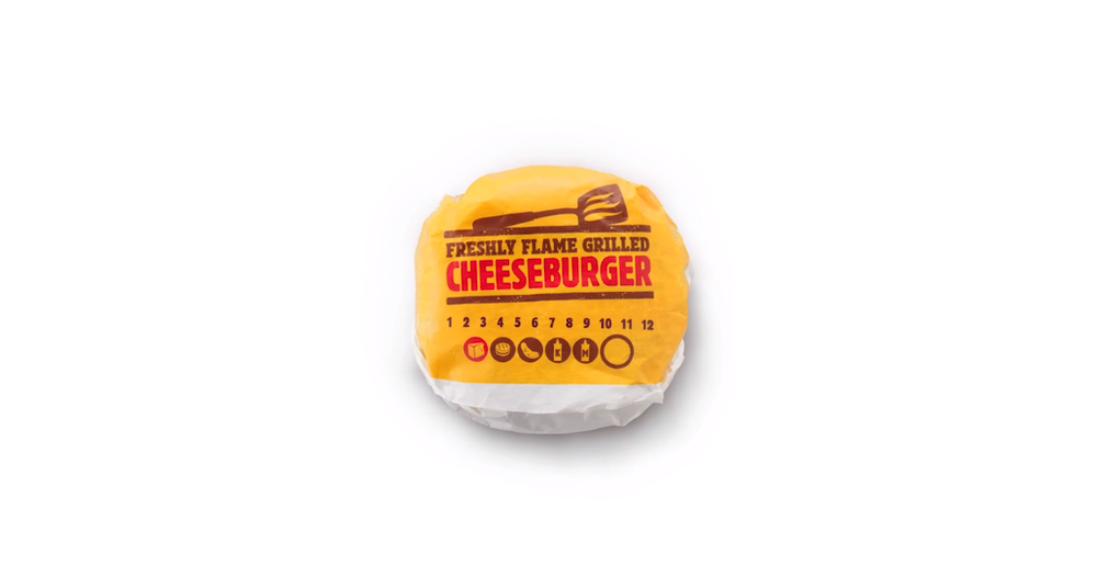
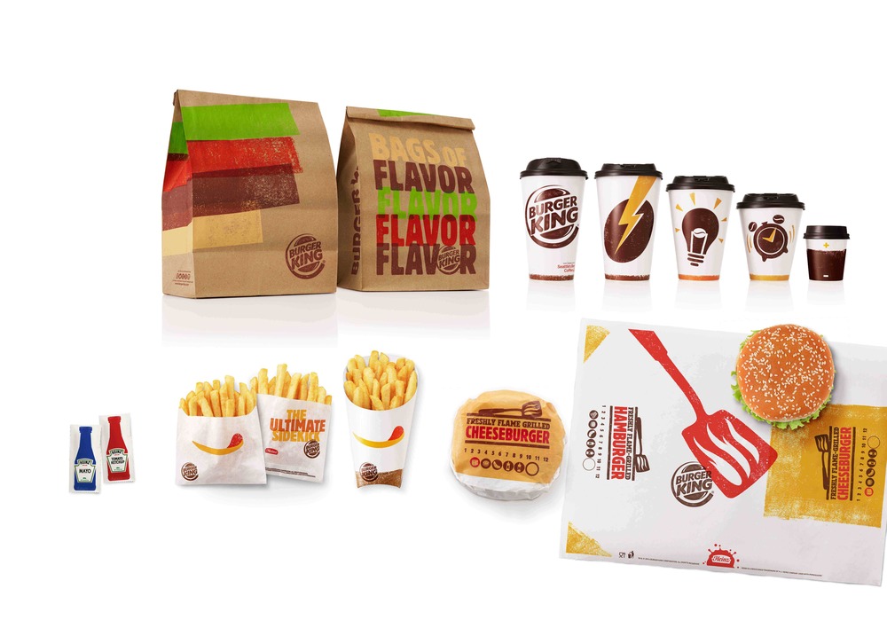
Burger King has redesigned the visual identity for their global food packaging.
Burger King’s new brand positioning is “Be Your Way” encouraging customers to be themselves, because Burger King Burgers are all flame grilled they all come out slightly different.
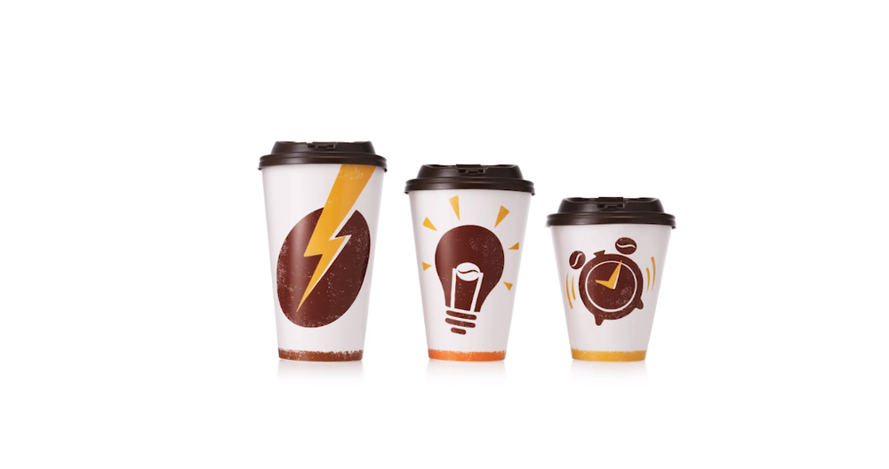
Each coffee cup has a different icon: an alarm clock for the small, a light bulb for the medium, and a lightning bolt for the large.
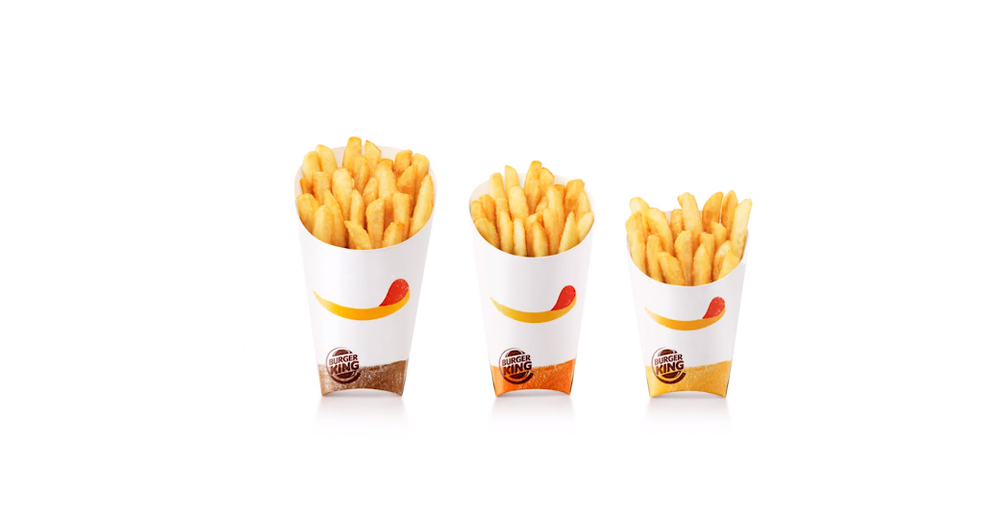
All the packaging has a hand printed effect reminiscent of the marks on the burgers made by flame grilling imperfect perfection.
Related article Social Media Activity of Burger Restaurants [Infographics]
