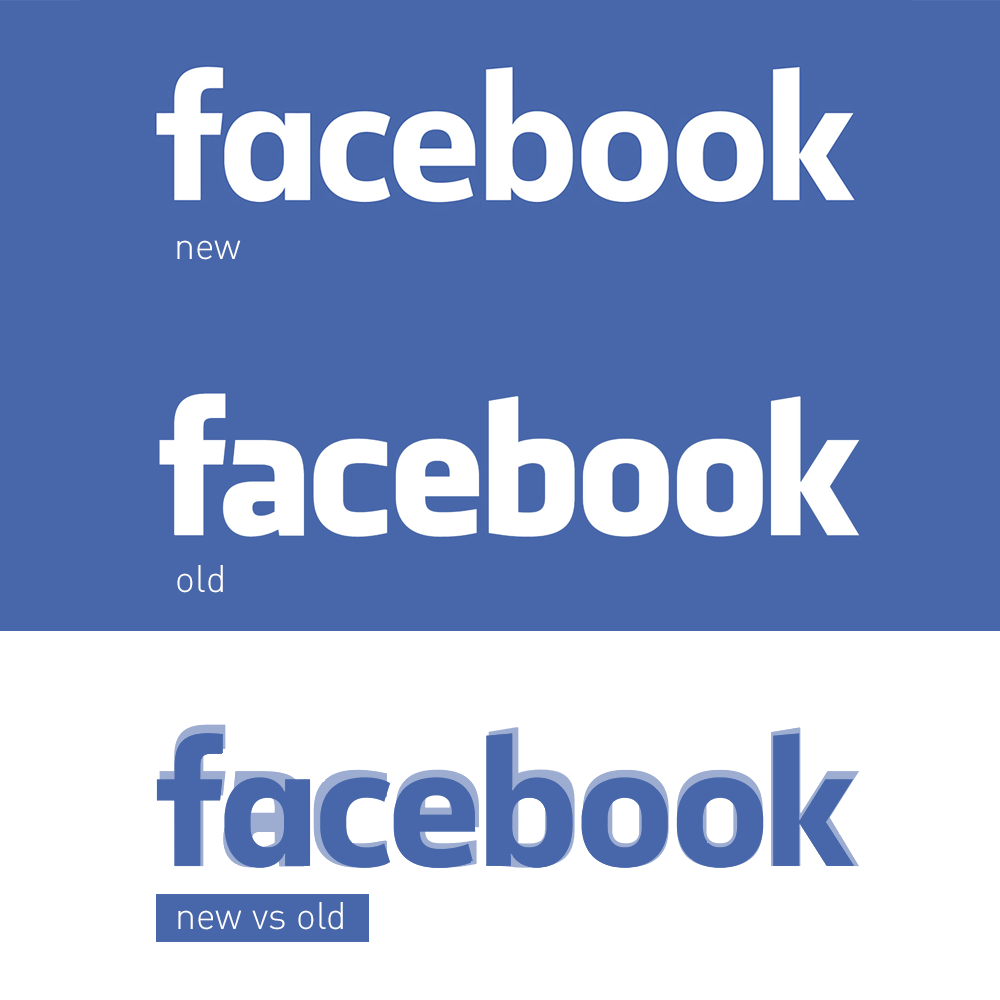
New Logo for Facebook
For the first time since 2005, Facebook has refreshed its logo.
What Changed?
The update focuses on Facebook’s wordmark—the text-only version of its logo used for brand identification. The classic combination of the Facebook blue background with white lowercase letters remains intact.

The noticeable change is the typeface:
- The font is thinner.
- The “a” has been redesigned.
The previous logo used the Klavika typeface, while the new version features a custom typeface designed specifically for Facebook.
The Vision Behind the Update:
According to Josh Higgins, Facebook’s Creative Director:
“The company set out to modernize the logo to make it feel more friendly and approachable.”
Instead of opting for a complete redesign, the team chose a more evolutionary approach.
What Stays the Same?
The iconic “F” logo remains unchanged and will continue to appear on apps, icons, and other branding materials. The update will only be visible when the full Facebook name is displayed.


